DATA VISUALIZATION
TORNADO TRACKER
Year
2024
Category
Data Visualization
Context
University Lab Week
Tools
D3.js, TopoJSON, NOAA Dataset
Project Overview
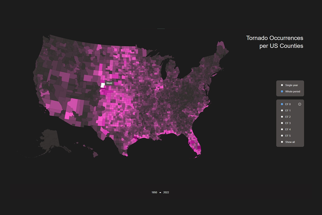
During our university's Lab Week, I created an interactive data visualization exploring tornado patterns across the United States. The project investigates how tornadoes develop and which regions are most affected by different tornado intensities from 1950 to 2022.
Data & Background
The visualization is based on a comprehensive dataset from the National Oceanic and Atmospheric Administration (NOAA), covering all tornado records in US counties from 1950 to 2022. Tornadoes are classified using the Enhanced Fujita Scale (EF-Scale), which rates tornado intensity based on damage caused rather than wind speed, as wind velocities are often difficult to measure accurately.
Interactive Visualization
The visualization uses TopoJSON format to display US counties as an interactive map. Users can explore tornado occurrences through color-coded county representations, with flexible filtering options for deeper analysis.
Year Selection
Filter data by specific years to analyze temporal patterns and identify peak tornado activity periods.
Intensity Filtering
View tornadoes by EF-Scale rating to understand the geographic distribution of tornado strengths.
Cumulative View
Display aggregated data across all years for comprehensive long-term trend analysis.
Key Insights
The interactive visualization reveals significant patterns in tornado distribution across the United States, highlighting the concentration of severe weather events in specific geographic corridors and seasonal variations in tornado activity over the decades.
Workshop Outcome
This Lab Week project provided hands-on experience with large-scale geospatial data visualization, D3.js implementation, and interactive data storytelling techniques for communicating complex meteorological patterns to diverse audiences.